Solitea and its sub-brands such as the well-known invoicing system iDoklad or the accounting system Money, Vema, Byznys and others have undergone a fundamental rebranding process. Its objective was to create a generally well-known, unmistakable and strong brand.
Solitea was established in 2014 through the merger of several successful Czech development companies. "Its name is based on the Latin word "solutio", which is exactly what our company represents - a solution", explains the company's founder Martin Cígler. In its logo, Solitea had a blue spiral resembling the letter S. The brand, however, functions as an umbrella for all the IT subsidiaries of the company and has communicated with the public only in the Enterprise & Public segment. The company currently has over 1,200 employees who create products and provide customer support for almost 300,000 users.
Give the brand a system
Solitea underwent a partial redesign two years after it was established. Year 2020 saw the fusion of all the companies under the Solitea brand and thus necessitated more fundamental rebranding. The new brand consists of two simple rectangles resembling the letter S.
"The new simple symbol makes it easier for us to work with the complete portfolio of brands under Solitea. We can, furthermore, see that it contains key markings, whether it be the DNA helix, synergy or dynamics", explains the author of the logo Radoslav Cichý. The logo is simple, understandable and thus also easy to remember.
Strength in unity
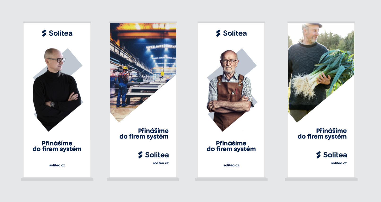
Solitea kept its blue colour that expresses its serious approach and stability. However, it was given a darker tone. The sub-brands underwent the most significant change. All now carry their product name and the name of the mother company. They use the same logo and visual style. They only differ in the colouration and tonality of photographs, which change based on the target group. The system can easily be applied to new products that become a part of the Solitea family. But what is more important? Thanks to this, all the product lines will communicate the same brand, which will be better known and stronger.
Solitea brings customers a stable solution that is developing and regularly updated, as well as products sharing new knowledge and technologies or opportunities for simple interconnection of various systems. All these advantages have, thanks to their common branding, also carried over to the visual identity of the brand.
We started a motivation campaign
The very first campaign that Solitea launched at the beginning of October is focused on attempting to motivate entrepreneurs during a time when an economic downturn is expected. "We noticed that many successful companies grew thanks to the courage of their leaders. While others sat on the fence, they had the courage to invest into improving the effectiveness of their company's processes. Thanks to this, they got a head start on their competition," notes Marketing Director at Solitea, Daniel Šturm.
Solitea converted this solution into the message "Don't stand still" and "Don't wait", that you may come across on the streets of Czech towns and cities. Via this campaign, it communicates that it is precisely at the time of crisis when entrepreneurs can get an edge on the competition. In particular by making processes more effective they can save capacity, time of employees and automate those processes where it is possible. Entrepreneurs can find out more in the solution menu at Solitea's website. Simply summon up the courage and invest in IT solutions that today are the best medicine for quarantine.